We are proud to announce that our logo redesign for DoughMain.com has won an American Graphic Design Award. This is a national design competition that has been running for eight years servicing advertising agencies, graphic design firms, corporate, institutional and publishing in-house departments.
![]()
The client expressed the necessity of a trusting and friendly image for their target audience of families — specifically moms. The new logo has a warm yet modern feel to it — almost like a hip new retail brand. Rather than taking a literal approach to money and savings, we opted to use bright colors and a warm rounded mark that would be interesting and attractive to families.
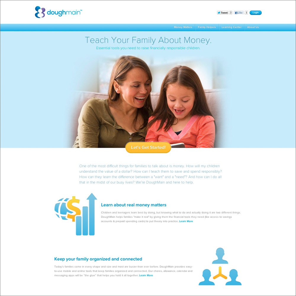
DoughMain.com offers a series of web applications to help educate children about money. Children and teenagers learn best by doing, but knowing what to do and actually doing it are two different things. DoughMain helps families “make it real” by giving them the financial tools they need (like access to savings accounts & prepaid spending cards) to put theory into practice. Their chores, allowance, calendar and messaging apps are “the glue” that helps families hold it all together. And their Learning Center explains financial concepts in easy to understand terms.